

Have you ever opened a website on your phone and found yourself zooming in just to read the text, trying to tap tiny buttons, or watching images awkwardly spill off the screen? Yep, we’ve all been there. That frustrating moment is exactly why Responsive Web Design matters more than ever.
In today’s digital world, where users jump from laptops to tablets to phones without a second thought, having a mobile-friendly design isn’t optional; it’s expected. A responsive site automatically adjusts to any screen size, ensuring everything stays readable, functional, and visually appealing no matter the device.
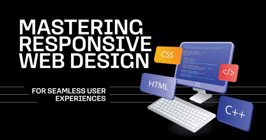
At Bloom House Marketing, we’re passionate about crafting seamless online experiences. This post will walk you through the essential concepts, tools, and trends you need to master responsive web design, from flexible grid layouts and media queries to fluid images and the viewport meta tag.
Core Principles of Responsive Web Design
So, what does responsive web design mean? Simply put, it’s a design approach that allows your website to adapt dynamically to different screen sizes and device types. Whether someone is viewing your site on a smartphone in portrait mode or on a widescreen monitor, the layout reshapes itself to offer the best possible experience.
A few critical components drive this adaptability. First, the viewport meta tag tells browsers how to scale your site on different devices, making it the foundation for mobile responsiveness.

Then come media queries, which apply specific CSS styles based on screen characteristics like width, resolution, or orientation. Combine those with flexible grid layouts, where elements are sized in relative units rather than fixed pixels, and you’ve got the blueprint for a responsive design.
Finally, don’t forget the role of fluid images, which automatically scale within their containers to maintain their shape and avoid overflowing on smaller screens. Together, these tools form the backbone of an intuitive, elegant, and accessible user experience design. For a deeper look into the fundamentals, we recommend this Responsive Design guide from MDN Web Docs.
Importance of Flexible Layouts and Grids
Now, let’s talk about structure because a site’s layout is what holds everything together. A flexible grid layout is one of the most powerful tools in responsive design. It allows you to divide your content into columns that expand and contract based on the screen size, helping your website maintain a consistent structure across devices.
Imagine you’re designing a three-column layout for a desktop. That layout might automatically shift to two columns or stack into one on a smaller screen. That flexibility ensures that content remains easy to read and navigate without users needing to scroll sideways or pinch-zoom.
The best part? Today’s CSS frameworks like Bootstrap and Tailwind CSS make building responsive layouts more accessible than ever. They come packed with built-in classes and utilities explicitly designed for responsiveness, so you don’t have to reinvent the wheel.
Optimizing Images and Media for Responsiveness
Images are a significant part of any website, but if not handled correctly, they can be a nightmare on mobile. That’s where fluid images come in. Instead of locking an image into a fixed width, fluid images scale naturally within the layout, keeping visuals proportional and avoiding awkward breaks or overflow.
But there’s more to it than just size. For high performance and fast loading, especially on slower mobile networks, you’ll want to use techniques like srcset and sizes in your image tags. The browser can choose the most appropriate image file depending on the user’s device and screen resolution.
Video content also benefits from responsive treatment. Wrapping your video containers with CSS that maintains aspect ratios (using aspect-ratio or clever padding tricks) ensures your media scales correctly without cutting off or distorting.
To quickly check your site’s responsiveness, use the Google Mobile-Friendly Test Tool to see how your images and layout behave on different devices.
Implementing Responsive Typography
Let’s be honest, if your visitors can’t read your content comfortably, it doesn’t matter how pretty your site looks. That’s why responsive typography is crucial.
Instead of setting font sizes in rigid pixels, use relative units like em and rem that scale with the user’s settings and device preferences. This ensures that your text adapts as the screen size changes, maintaining legibility and balance.
Media queries can help fine-tune typography at different breakpoints, adjusting font size, line spacing, and even typeface. For example, body text might appear at 18px on a desktop but scale to 16px on a smartphone for better readability.
Good typography isn’t just about font size; it’s about creating a comfortable and frictionless reading experience on any device. Pair this with a thoughtful mobile-friendly design, and your content will truly shine.
Testing and Analyzing Responsive Designs
Responsive design isn’t just about writing the correct code, it’s about testing it. A flawless design on your laptop might fall apart on someone else’s Android tablet. That’s why rigorous testing is key to any responsive project.
Start with your browser’s developer tools. Chrome DevTools is excellent for simulating screen sizes and checking how your layout responds. But don’t stop there. Test your site on real devices whenever possible. Phones, tablets, desktops, your hands on whatever you can.
Tools like BrowserStack or Responsively App let you view your site across multiple devices and screen sizes simultaneously, making it easier to spot issues. You can also run audits using Google Lighthouse to uncover accessibility, performance, and mobile usability concerns.
This helps ensure that your media queries, fluid images, CSS frameworks, and overall user experience design are in harmony.
Future Trends in Responsive Web Design
The world of responsive web design evolves quickly, and we stay on top of the latest techniques and technologies to keep our clients ahead of the curve.
One of the most exciting shifts we’re watching is the adoption of container queries. Unlike media queries, which respond to the overall screen size, container queries reply to the size of individual elements. This means your design can adapt even more precisely, within components, not just the entire layout.
We’re also seeing dark mode responsiveness become a new standard. Many users now prefer dark interfaces, and using CSS to adapt your design based on system settings helps ensure comfort and accessibility.
Meanwhile, CSS frameworks continue to evolve. Tailwind CSS, for example, is making it easier to create mobile-friendly designs with utility-first classes that are responsive out of the box. We don’t just follow these trends; we implement them. It’s all part of how we help businesses deliver cutting-edge, seamless digital experiences.
Transform Your Website Into a Responsive Powerhouse at BloomHouse
If your website still feels clunky on mobile or falls apart on a tablet, it’s time to upgrade. A great website shouldn’t just look good; it should feel right on every screen.
At BloomHouse Marketing, we specialize in responsive web design using all the latest tools from flexible grid layouts and media queries to fluid images, viewport meta tags, and modern CSS frameworks.
Most importantly, we prioritize user experience design in everything we do. Ready to take your site to the next level? Contact us today, and let’s build a website that’s as flexible and forward-thinking as your brand.

FAQs
How does mobile-friendly design impact user experience design on different devices?
A mobile-friendly design ensures content is readable and usable on smaller screens, leading to a smoother user experience and higher engagement across all device types.
What role do flexible grid layouts play in creating a responsive web design?
Flexible grid layouts allow content to shift and reflow based on the device’s screen size, keeping the structure clean and navigable on any screen.
How can media queries be effectively used to manage breakpoints in responsive web design?
Media queries apply specific styles at set breakpoints, helping tailor the layout, fonts, and spacing for various screen widths and orientations.
Why are fluid images important for maintaining the integrity of a responsive design across various screen sizes?
Fluid images resize within their containers, preventing layout breaks and ensuring visuals scale beautifully across all devices.
How does the viewport meta tag enhance user experience by adjusting CSS frameworks for different devices?
The viewport meta tag controls how your site is scaled and rendered on mobile devices, enabling CSS frameworks to apply responsive styles accurately.


